magazine report.
The development of the magazine was hard. I didn’t want to seem like some ordinary magazine article that just criticised the artist and chewed them up and spit it out. Although frank is very minimalistic he always had another side to himself where it’s funky , colourful and eye catching. I wanted it seem bizarre but interesting. I read many articles about him and every writer wrote about him in a admiring way. So I did the same , considering you’re supposed to promote the album it’s self I had to make it seem like it was designed by people who frank knew well .
Visually, I promised to make it colourful. I added in so many colours that it was like eye candy. The only issue is that I probably added in too many transitions in the video it’s self that sometimes from and outside viewer that doesn’t know much about frank ocean didn’t understand the ‘ hype ‘. I needed to bear in mind that you are not making it for you you are making it the viewers to buy. And unfortunately I didn’t follow that at all times.
My target audience was found via doing research. Most people said that it’s 18- 35 years olds who are heavily involved in social media and things like tumblr. Considering I am a tumblr user I knew exactly how to design my advertorial and poster. It had to seem alternative , different , unique and that’s always the vision of frank ocean. And I fully understood what his perception is.

To evaluate, the magazine article looks professional. its clear simple and easily presentable . my main aim was to make it seem frank ocean wrote it himself. personally i belived i succeded that aim. i got numerous amount of feedback and people like it. My main aim was to make sure it wasnt what i liked, but what the audience liked. to improve i belive i need probably more information. more in depth about frank ocean himself and about the album, considering i am promoting the album i need to talk about it more. i tried to design it as frank would himself.
research :
https://blonded.co/
This is frank oceans official website , this was one of my main
reasons for my design. its modern and quirky.
https://dexternavy.com/Dexter navy was a good example because it has the same design mentality and layout I envisioned on my advertorial. the website is about designers and photo lookbooks such as stussy clothing or music for asap rocky. the layout of dexter navy is what i wanted, i didnt want to copy them. but the website is ideal for my project. its random , minimalistic and quirky.
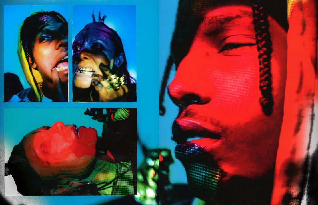
this photo had a huge impact on my magzine report. because the album i am is slow , moody and alternative. but its artwork is vibrant. and this photo has disturbing images but vibrant co,lour , exactly what my article is leik. its portraying the happiness but deep inside its dark and moody, exactly like franks album and how i wanted my work to look.


Comments
Post a Comment